
In the age of innovative tech giants like iPhone and Amazon, people have been trained to expect an intuitive experience when they access online software tools or applications. If a user has a poor or inefficient experience in an application, they can quickly and easily move on to another app that can offer what they need. These shifting expectations and demands among online users mean investing in an intuitive user experience can no longer be considered a "nice to have" in the insurance space.
The two design elements that are key to creating this satisfying digital experience are user experience (UX) and user interface (UI).
These components are also good for business with studies showing that companies investing in UX see large returns on investments, with an average ROI of 9,900% according to a study by Forrester. In more ways than one, it pays for the insurance world to invest in the usability of their software tools.
At Vertafore, we are committed to leading this charge in InsurTech.
What is UX and UI?
UX and UI are often used interchangeably, but each have unique capabilities that contribute to a user’s overall digital experience. UX is about the overall architecture and feel of the experience, while UI is all about how the product’s interfaces look and function.
"A UI without UX is like a painter slapping paint onto canvas without thought; while UX without UI is like the frame of a sculpture with no paper maché on it. A heightened product experience starts with UX followed by UI."
- Rahul Varshney, co-creator of Foster.fm
To break it down further, the goal of UX design is to improve customer satisfaction through an easier-to-use and enjoyable user experience. UX designers strive to create “happy paths,” or the ideal way a user will engage with a digital product, app, or site.
To see what this looks like in real life, think about a solution we all use: email. When you compose an email, the “happy path” looks like this: you open the new email, start entering the person you want to send it to, and your system autofills the contact. Then, you fill out the subject line, draft the email, add an attachment, and successfully send it.
In contrast, the “sad path” would be if your system can’t find the email address when you start typing it in, if you accidentally type in the wrong email address, or upload an attachment that is too big, and it fails to upload.
UX designers consider all of these potential outcomes by doing research to learn what the end-users need and why. That research ensures the general layout of a solution is useable and useful, and that the user understands when they are not on the “happy path” and how to get back there as quickly as possible.
On the other hand, UI creates all the visual elements that makes the software tools easy to use and understand through consistent and clean visuals. It also adds another layer of usability and delight through visual treatments.
UI is also key in ensuring software applications adhere to legal accessibility requirements such as those provided in the American Disability Act of 1990. Many companies also consider it a social responsibility to ensure all potential users, including people with disabilities, have a suitable user experience and are able to easily access information. UI can boost this accessibility with design decisions such as large font sizes, contrasting colors, and explanatory link text.
Why UX/UI matters in InsurTech
Our focus at Vertafore is on automating and simplifying insurance distribution, and UX/UI is a key contributor to achieving that.
Insurance professionals spend a significant portion of their day working in their software tools, so it’s critical the tools are easy to use and reduce friction in a user’s day-to-day activities. Good UX and UI create a software experience that is more intuitive, helps users complete common tasks, and eliminates redundancy—resulting in overall improved efficiency of employees.
Additionally, investing in these time-saving digital tools is key for attracting new talent to the insurance industry, which is already facing a huge transition in its workforce. Vertafore’s recent survey of the independent insurance agency workforce highlighted the industry’s large generational talent gap with the finding that 35% of respondents were 56 or older, and only 25% of respondents were under age 40. It’s clear there is an urgent need to attract employees of a younger generation, and these tech-savvy professionals don’t want to work for companies with outdated software that looks like it was created decades ago.
Vertafore investing in UX/UI with new products
For these reasons, Vertafore has been investing in more sophisticated UX/UI to streamline the online experience for our customers. Vertafore MarketTrends—our new, easy-to-use tool taps that into the industry’s largest, most up-to-date benchmarking dataset to help our customers drive more renewals and close more business—is a great example of how UX and UI are guiding our product development.
A few of the functionalities that powerfully utilize UI/UX:
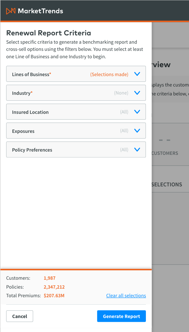
- Improved information architecture that puts information into more intuitive and logical groupings. This contributes to an enhanced hierarchy that makes it easier and quicker for users to find what they’re looking for.
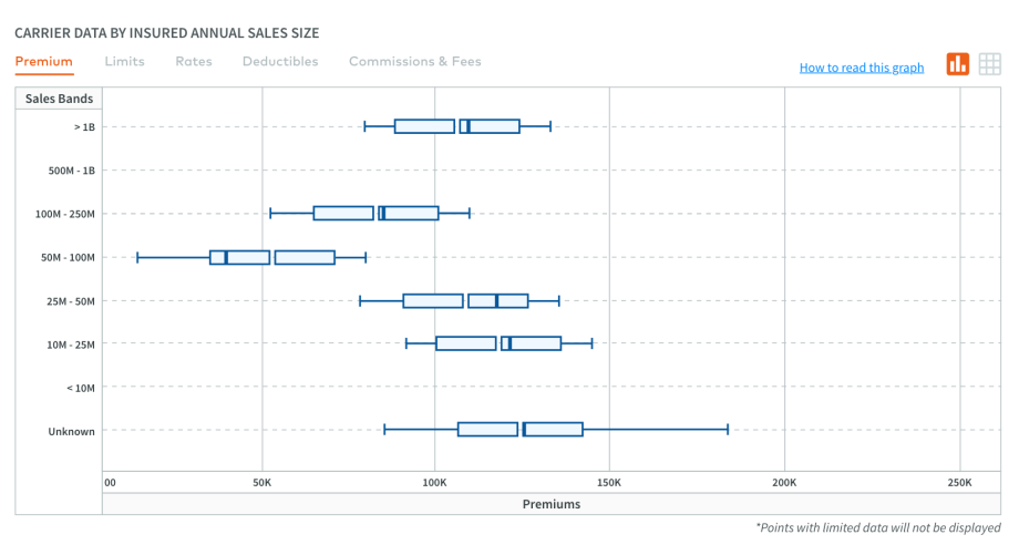
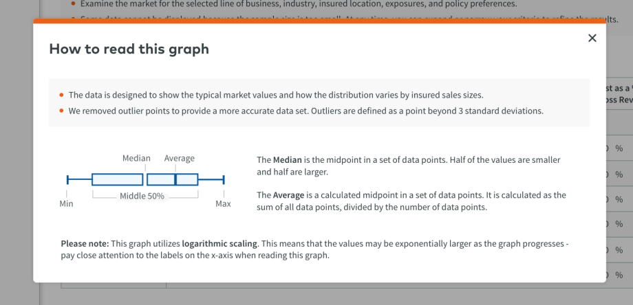
- Enhanced data visualization for users with a “how-to read this graph” pop-up. Embedding these explanations into the software helps users get the most out of the tool without having to be data experts. We also ensured that averages and medians are always present and removed outliers so that users have a clear view of what is most important.
- Streamlined workflow options that create one central place for all filtering. Having this place for filtering fixed a cumbersome workflow by eliminating redundant clicking and inconsistent interactions.
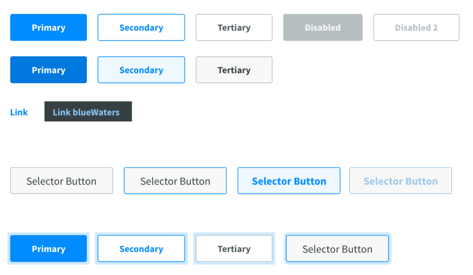
- Improved accessibility with visual updates such as contrasting designs, colors, and interactive buttons. Color contrast is especially important for software tools because it affects some people’s ability to visually receive information.
At Vertafore, we believe in the importance of providing easy-to-use and intuitive solutions for our customers, and we are proud to be part of InsurTech’s push to bring innovative architecture and design to our products.